반응형
프론트엔드 필수 반응형 CSS 단위 EM과 REM
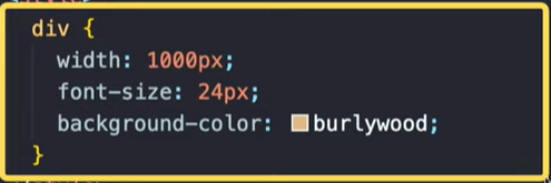
CSS 기본 형태
selector {

 property : value;

}
절대적 사이즈 유닛 : px
- px : Pixels
- 픽셀이란, 모니터위에서 화면에 나타낼 수 있는 가장 작은 단위
- 고정된 사이즈라 컨테이너 사이즈가 바뀌어도 폰트사이즈 그대로.
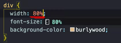
컨테이너에 따라 사이즈가 바뀔 수 있도록 px대신 %로 설정하기도 한다.
상대적 사이즈 유닛 중 주로 쓰이는 유닛
- 부모 엘리먼트 기준으로 사이즈 할당
- 부모 무관하게 브라우저 기준으로 사이즈 할당
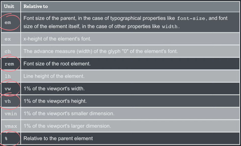
1. 부모 엘리먼트 기준 할당
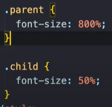
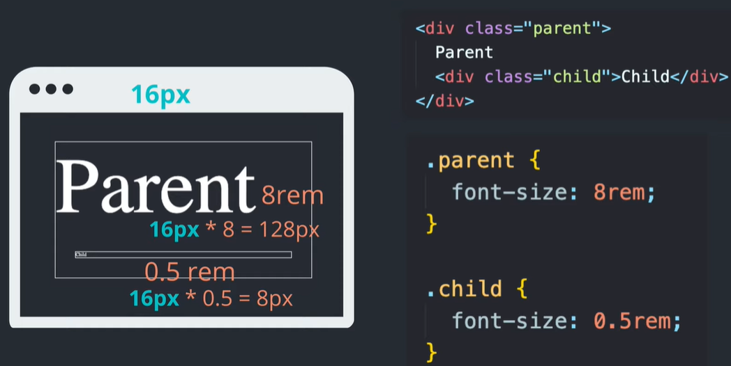
em (%도 마찬가지)
- 부모 엘리먼트를 기준으로 상대적으로 사이즈 반영
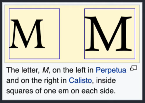
- 현재 지정된 폰트 사이즈를 나타내는 단위.
- 동일한 font-size라도 폰트 종류에 따라 사이즈가 달라짐
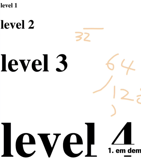
- 1em == 16px (기본 html폰트사이즈)
- html의 디폴트 폰트 사이즈는 16px(1em)
- 하위 태그는 부모의 폰트 사이즈를 기준으로 계산됨
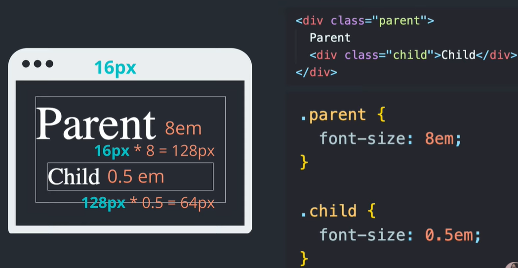
em 예시

2. 부모 태그, 부모 엘리먼트와 무관하게 브라우저 기준으로 사이즈 할당
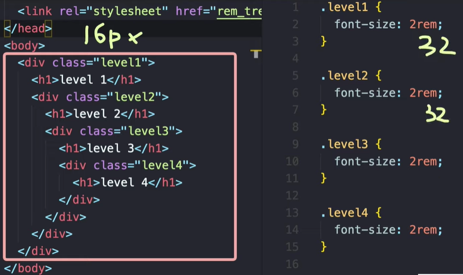
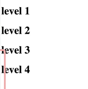
rem
- root를 기준(body태그)으로 사이즈 반영
- 기본적인 html의 폰트사이즈는 100%로 되어있음. (100%는 사이즈변경이 가능)

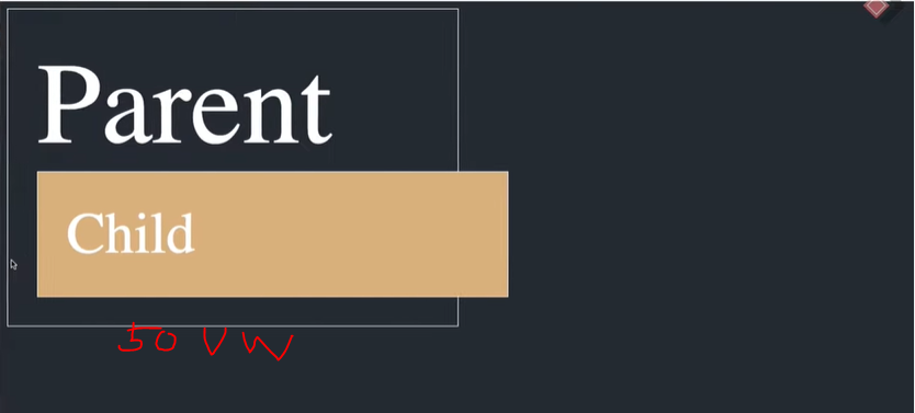
vw : viewport wide
- 100vw는 뷰너비 전부를 쓴다는 의미
- 50vw는 뷰너비 절반을 쓴다는 의미
- 부모요소와는 무관하게 브라우저 너비에 따라 반영됨
vh : viewport height
- 100vh
- 50vh
| 사이즈 기준 | 변경 대상 | ||
| % | 부모 태그, 엘리먼트 | 너비,높이 기준 (BOX) | |
| em | 부모 태그, 엘리먼트 | 폰트 사이즈, 패딩 | |
| rem | 브라우저 | 폰트 사이즈, | |
| vw, vh | 브라우저 | 너비,높이 기준 (BOX) |
px사이즈와 em 사이즈 변환 계산기
PXtoEM.com: PX to EM conversion made simple.
What is an EM? Wikipedia puts it well: "An em is a unit of measurement in the field of typography, equal to the size of the current font." If your font-size is at 16 pixels, then 1em = 16px For more information visit Wikipedia and Mozilla MDN. What is the
pxtoem.com
반응형
'○ WEB > 19.03 FastCampus_CSS' 카테고리의 다른 글
| [드림코딩] 무료 폰트, 무료 로고 이미지 사이트 (0) | 2021.03.03 |
|---|---|
| [드림코딩] 반응형 헤더(Responsive Header) 만들기. 종합 정리 (0) | 2021.03.02 |
| [드림코딩] CSS 기초 : padding, display, position, flexbox, justify, align (0) | 2021.03.01 |
| font-family (0) | 2019.07.27 |
| input, button 태그의 외부, 내부링크 걸기 / href / onClick (0) | 2019.07.26 |

